On this page:
Intro ▪ Prior designs ▪ Beyond ASCII ▪ My past designs ▪ Honourable mentions ▪ Results
Research
Much of my interest in the topic was piqued by Damien Guard’s article, Typography in 8 bits: system fonts. In preparation for this project, I decided to conduct an even more comprehensive study of classic dot-matrix fonts, with a focus on those using the iconic 5×7 dot matrix capitals. In the end, over 40 existing 5×7 font designs were studied.
These example fonts are presented in approximate chronological order, ranging from the 1960s to the present day. This list is by no means exhaustive; it simply contains all the examples I could find.
Many of the fonts depicted below contained a full set of 128 or 256 characters, including special glyphs for pseudo-graphics applications, other scripts, etc. So as to compare the glyph designs themselves rather than the character sets, only the standard ASCII ranges of each font are reproduced here (equivalent to Unicode's Basic Latin block). The original systems employed character cells of various sizes, resulting in different spacing between characters and lines. For clarity and consistency, the fonts have been presented here with 7×10 dot character cells.
I have arranged my comments on the fonts in PMI format: Plus (pros), Minus (cons) and Interesting. The earlier examples tend to attract more comments not necessarily because they are more idiosyncratic, but because each particular quirk is mentioned here only once. Much more could be written about each font if they were critiqued individually.
All images on this page are made available under the Creative Commons Zero licence (public domain dedication)
Prior designs
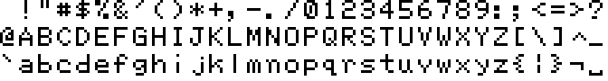
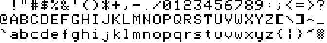
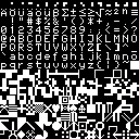
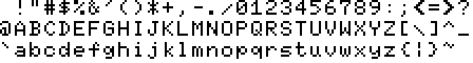
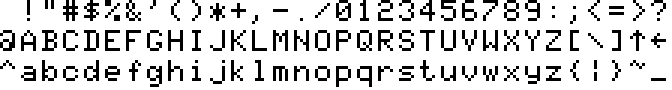
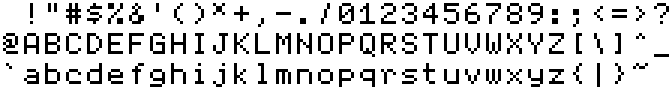
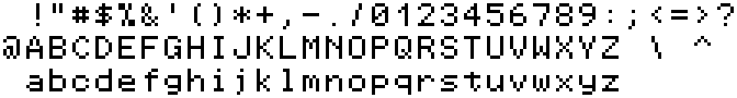
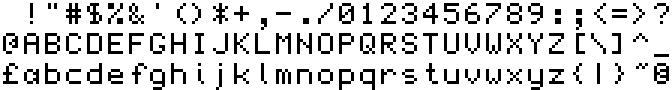
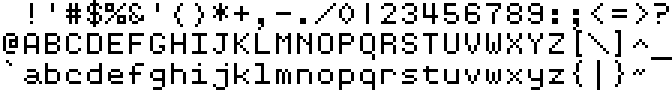
IBM 029 Card Punch

Reference: Norbert Landsteiner — Punched Card Typography Explained
Font replicating this design: Keypunch029 by Stewart C. Russell
The IBM 029, a machine for creating punched cards, was introduced in 1964 to replace the 026 Printing Card Punch from 1949. I decided to show the 029 character set here because it could print a few more characters than the 026. They are the two oldest dot-matrix character sets I have found in my research. They are so old, in fact, that the patterns were stored on a metal “code plate” since electronic read-only memories — indeed, integrated circuits (or silicon chips) in general — were yet to be invented.
Despite their advanced age, a majority of these glyphs have stood the test of time, appearing the same as newer 5×7 dot matrix fonts. There are only a couple of truly unusual designs, like the letter S which was probably chosen to differentiate it from the number 5.
| P 😍 | M 😕 | I 🤔 |
|---|---|---|
|
|
|
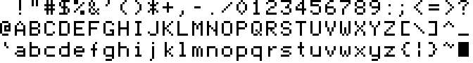
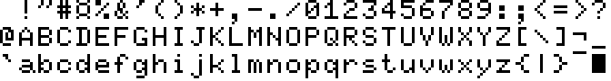
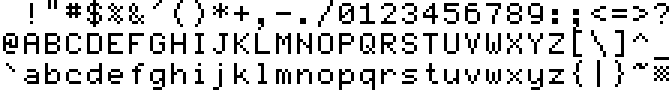
Project Intrex
Reference: Paul Allen King Jr. — A novel solid state character generator
While searching Internet Archive for information, I found a 1969 thesis about the development of a character generator for an automated library system at MIT. This device supplied character patterns for a computerised video display, still quite a novel concept at the time. The dot matrix data were stored in a hand-woven core rope memory.
The character set depicted here was actually not intended to be used directly, but instead with interpolation circuitry that smoothed curves and diagonals to produce a 9×13 dot matrix. As such, many of the designs are unconventional or suboptimal in appearance in their 5×7 form.
| P 😍 | M 😕 | I 🤔 |
|---|---|---|
|
|
|
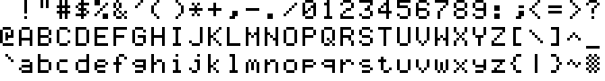
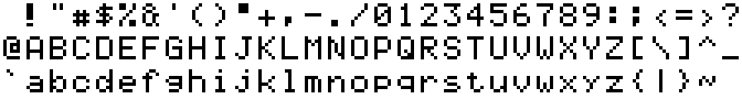
Texas Instruments TMS4103

Reference: Centronics 101 brochure
The TMS4103 was an early MOS character generator: that is, a special ROM chip containing character bitmaps. These devices were standard parts stocked by their manufacturers, without the need for a custom order as with ROMs in general. The TMS4103 dates back to at least 1970, when it was used in the first dot-matrix printers, the Centronics 101 and DEC LA30 DECwriter (well, I assume it was also used in the 101, since its character set is identical to that of the LA30).
| P 😍 | M 😕 | I 🤔 |
|---|---|---|
|
|
|
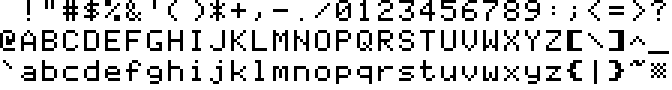
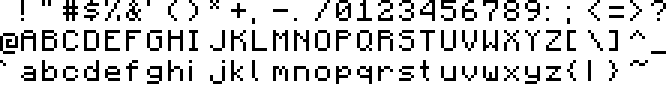
Fairchild 3258

Reference: 3258 datasheet
Another character generator from the early 1970s.
| P 😍 | M 😕 | I 🤔 |
|---|---|---|
|
|
|
General Instrument RO-5-2240S

Reference: RO-5-2240S datasheet
Yet another character generator. The glyph patterns are similar to those of the Fairchild 3258 above, with only a few differences.
| P 😍 | M 😕 | I 🤔 |
|---|---|---|
|
|
Mostek MK2408P

Reference: MK2408P datasheet
Still another character generator.
| P 😍 | M 😕 | I 🤔 |
|---|---|---|
|
|
|
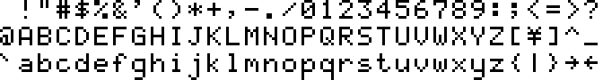
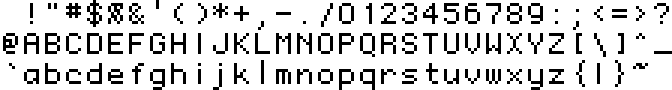
National Semiconductor MM4240
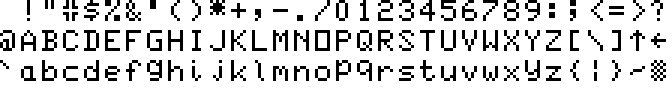
Reference: MM4240 application notes
This is a composite of two character sets: those of the MM4240AA (capitals only) and MM4240AE (small letters only) character generators. Like most such devices from the era, the glyphs are strictly confined to the 5×7 dot matrix, forcing the descending letters g j p q y to sit high on the baseline. The designs of the small letters appear to have been influenced by traditional handwriting; note especially a b d e g l p q y.
Apart from the slash / and 7, all the characters up to Z are identical to those of the IBM 029. There seems to have been a trend of including a crosshatch graphic in the 0x7F position, also seen in several of the character sets below. This could serve as a blinking cursor on video displays.
| P 😍 | M 😕 | I 🤔 |
|---|---|---|
|
|
|
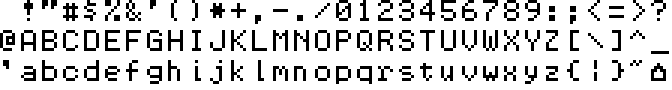
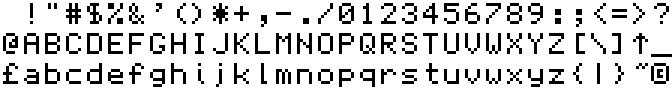
Motorola MCM6674
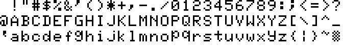
Reference: MCM6674 datasheet
Font replicating this design: Another Man’s Treasure by Rebecca G. Bettencourt
This character generator is notable for having being used in the Tandy/Radio Shack TRS-80 Model I computer. It was relatively advanced in that it contained glyphs for all 128 possible ASCII codes, including lower-case letters.
Apart from O and S, the capitals are identical to those of the IBM 029.
| P 😍 | M 😕 | I 🤔 |
|---|---|---|
|
|
|
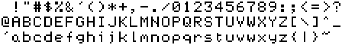
Signetics 2513
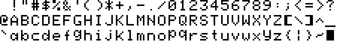
References: Signetics 2513 and GI RO-3-2513 datasheets
This is another composite of two character sets, belonging to the 2513/CM2140 (upper case) and 2513/CM3021 (lower case) character generators. The 2513 was a common part that was also produced by other manufacturers like General Instrument. This chip, with the upper-case-only character set, was used by the Apple I and Apple II computers.
| P 😍 | M 😕 | I 🤔 |
|---|---|---|
|
|
|
National Semiconductor DM8678
Reference: DM8678 datasheet
This is also a composite of character sets, from the DM8678CAB (upper case) and DM8678CAH (lower case) character generators. The DM8678CAH still contained only 5×7 dot matrices for each glyph, but shifted the descending letters g j p q y by two lines during output in order to display them correctly. This has the side-effect of making j appear sunken, with its dot at the waistline of the font.
| P 😍 | M 😕 | I 🤔 |
|---|---|---|
|
|
|
Mullard SAA5050
Reference: SAA5050 datasheet
Font replicating this design (with totally smooth diagonals): Bedstead by Ben Harris
This chip was designed for Teletext applications and also saw use in home computers such as the BBC Micro. A full nine dots of height are available here, allowing for descenders that properly match the ascenders. The SAA5050 was able to interpolate these glyphs, to produce a 10×18 matrix with less jagged diagonals.
| P 😍 | M 😕 | I 🤔 |
|---|---|---|
|
|
|
Trendcom 200
Reference: Silentype manual
The Trendcom 200 was a thermal printer designed for use with personal computers. It is best known for being rebranded as the Apple Silentype, Apple’s first printer. It has one of the more interesting character sets on this list.
| P 😍 | M 😕 | I 🤔 |
|---|---|---|
|
|
|
Apple IIe
Reference: KreativeKorp — Ultimate Apple II Font
Font replicating this design: Print Char 21 by Rebecca G. Bettencourt
The first 64 glyphs (the first two rows here) are lifted from the Signetics 2513/CM2140 character generator, used in the earliest Apple computers.
The latter 32 glyphs were added to the Apple III (1980) and subsequently the Apple IIe in 1983 (with the crosshatch at 0x7F replacing the Apple logo from the Apple III font). The larger character cells on these systems allowed for descenders on the small letters, if somewhat stunted at only one dot below the baseline.
| P 😍 | M 😕 | I 🤔 |
|---|---|---|
|
|
|
Motorola MC6847

Reference: Wikipedia
Font replicating this design: Hot CoCo by Rebecca G. Bettencourt
This video chip, with built-in character generator, was used in the Tandy/Radio Shack TRS-80 Color Computer. It contains a set of negative (or inverse, i.e. white on black) capitals, which there was no need to reproduce here, instead of small letters. Notice that this set is nearly identical to that of the IBM 029 Card Punch seen above.
| P 😍 | M 😕 | I 🤔 |
|---|---|---|
|
|
Texas Instruments 99/4A
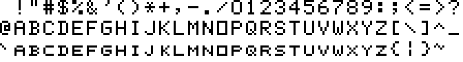
Reference: Classic99 emulator (see screenshot)
The TI 99/4A was another early home computer. Its character set has the rare inclusion of small capitals instead of lower-case letters; this may have been a compromise decision as the character cells are not deep enough for descenders. The small caps are generally well-executed and perfectly match the full capitals.
| P 😍 | M 😕 | I 🤔 |
|---|---|---|
|
|
|
Oric
Reference: Proposal to add characters from legacy computers and teletext to the UCS
The character set of the Oric series of home computers is almost identical to that of the Apple IIe, except for the altered comma, 2, 6, 9, colon, semicolon and square brackets, plus a few special characters in the non-alphanumeric positions.
| P 😍 | M 😕 | I 🤔 |
|---|---|---|
|
|
EACA Colour Genie
Reference: Colour Genie firmware (see graphic)
Another, less well-known, home computer from the early 1980s.
| P 😍 | M 😕 | I 🤔 |
|---|---|---|
|
|
|
COMX-35

Reference: COMX-35 firmware (see graphic)
This obscure home computer has one of the worst character sets I’ve seen (the ampersand & really does sit below the baseline; that wasn’t a mistake on my part!). There would have been plenty of room for lower-case letters if the set didn't have duplicate glyphs in different colours, multiple variations of the COMX logo and other useless pseudo-graphic characters. What’s more, the RCA CDP1870 video chip supports character cells 9 dots high, which would have allowed for lower-case with true descenders.
| P 😍 | M 😕 | I 🤔 |
|---|---|---|
|
Aquarius
Reference: Aquarius firmware (see graphic)
The Aquarius computer, manufactured by Radofin, is best known for being briefly sold under the Mattel brand. The first 64 glyphs in this set are identical to those in the upper-case Signetics 2513/CM2140 character generator (except the apostrophe!) and the latter 32 appear to have been derived from the lower-case 2513/CM3021 with some modifications.
| P 😍 | M 😕 | I 🤔 |
|---|---|---|
|
|
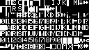
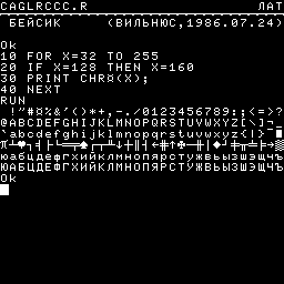
Commodore MPS-803
Reference: printout from my MPS-803
The MPS-803 was a dot-matrix printer designed for use with Commodore home computers. Being an 8-bit Commodore device, its built-in character set does not adhere to the ASCII standard, so this image has been rearranged for presentation here.
This has one of the cleanest, most consistent capital alphabets yet examined, but the small alphabet suffers from numerous quirks.
| P 😍 | M 😕 | I 🤔 |
|---|---|---|
|
|
|
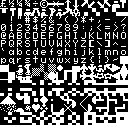
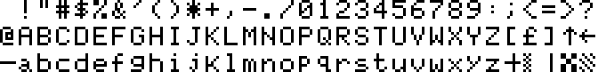
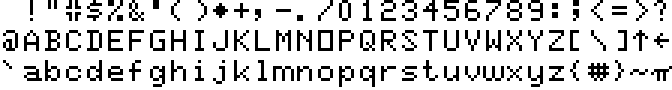
BASIC Level III (Sega SC-3000)
Reference: SC-3000 Survivors online emulator (see screenshot)
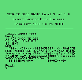
The SC-3000 was a computer version of Sega’s first game console, the SG-1000. Like the SG-1000 but rarely for home computers, it has no built-in ROM for firmware, instead relying on plug-in cartridges. This character set belongs to the BASIC Level III cartridge.
| P 😍 | M 😕 | I 🤔 |
|---|---|---|
|
|
|
MSX
Reference: La Nueva Escuela — Making an MSX font
Font replicating this design: MSX Screen 0 by Andy Teijelo
Inspired by successful industry standards like VHS and disappointed in the Wild-West fractured home computer market, several (mostly Japanese) manufacturers adopted a common 8-bit computer standard, MSX. The full character set is similar to that of the IBM PC, with the glyphs redesigned to fit the TMS9918 video chip’s text mode.
| P 😍 | M 😕 | I 🤔 |
|---|---|---|
|
|
Elektronika BK-0010
Reference: BK Back to Life emulator (see screenshot)
This is a rare example of a home computer from the Soviet Union. Overall, it has one of the nicest fonts on this list, with relatively few foibles. It also contains glyphs for the Cyrillic (Russian) alphabet, of course, so it can be a useful example for extending my font later.
| P 😍 | M 😕 | I 🤔 |
|---|---|---|
|
|
|
Samsung SPC-1000
Reference: Wikipedia
The SPC-1000 was Samsung’s first personal computer. It used the AMI S68047 video chip, similar to the Motorola 6847 and evidently with a very similar built-in character generator ROM. The latter 32 glyphs here are unique to the SPC-1000, however. Note that the relative letter spacing has been altered in the graphic above to accommodate a few 7-dot wide glyphs; this system used 8×12 character cells.
| P 😍 | M 😕 | I 🤔 |
|---|---|---|
|
|
Motorola MC6847T1
Reference: Wikipedia
This updated video chip was used in the late-model Tandy/Radio Shack TRS-80 Color Computer 2. It now contains a lower-case alphabet, with true descenders. Some of the unusual glyph designs have been cleaned up in this version, although some have also been made worse.
| P 😍 | M 😕 | I 🤔 |
|---|---|---|
|
Sega barcodes
References: Altered Beast and Black Belt case inserts
These numerals were found alongside the barcodes on some Sega Master System games. They contain some interesting features that I haven’t seen anywhere else. Some of those may have been inspired by the typeface OCR-B, which is normally used on EAN and UPC barcodes; that would explain the designs of the digits 1, 3, 4, 6 and 9 (but not 2, 5 or 7).
| P 😍 | M 😕 | I 🤔 |
|---|---|---|
|
|
|
Hitachi HD44780U
Reference: HD44780U Datasheet
This LCD controller, dating back to the 1980s, has been widely used in character LCDs. Particularly popular in hobbyist applications and commercial devices of low-volume production, there are hundreds of these modules available from dozens of manufacturers. Nowadays, such devices usually emulate the HD44780U’s behaviour and character ROM. Of the character LCDs available on Mouser at the time of writing (that list the glyph patterns in the datasheet, like this example), all appear to use nearly identical glyph designs, usually varying by only a few dots here and there. They are likely derivatives of each other, with differences probably due to errors in manual transcription. Shown here is the A00 ROM, which provides the option of true descenders (and very deep ones too, at 3 dots below the baseline).
| P 😍 | M 😕 | I 🤔 |
|---|---|---|
|
|
Terminal (Microsoft Windows)
Reference: app850.fon (system font file)
This font, aptly named Terminal, is used when a Command Prompt window is set to use the 6×8 raster font (those being the full character cell dimensions, including the gaps around the 5×7 glyphs). It dates back at least as far as 1992, in Windows 3.1’s DOSAPP.FON. It has quite a number of unusual features compared to the other fonts in this list. The design strikes me as something that was adapted from larger dimensions (the file does contain fonts of various sizes, possibly lending some credence to this idea), which may explain the unconventional design, odd proportions and inconsistent weight of certain glyphs.
| P 😍 | M 😕 | I 🤔 |
|---|---|---|
|
|
|
|
FF Dot Matrix Two
Reference: MyFonts — FF Dot Matrix
The earliest example I have seen of a commercial typeface imitating the 5×7 dot matrix style, dating from the early 1990s. Around that time, foundry FontFont also popularised another utilitarian style with their famous release, FF DIN.
| P 😍 | M 😕 | I 🤔 |
|---|---|---|
|
|
|
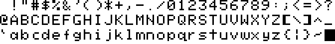
Fairfax
Reference: KreativeKorp — Fairfax
This open-source font by Rebecca G. Bettencourt was created for the stated purposes of coding and plain text editing, and has a wide Unicode coverage with support for some constructed scripts in the Unicode Private Use Area. Similarly to the font I wish to create, it is distributed as an outline font in TrueType format, having been converted from bitmaps using custom software.
Fairfax has the best lower-case b d g p q that I have seen in any 5×7 font. It is the only design examined here that has the conventional bowl shapes for these letters (see the National Semiconductor MM4240 section above). While still being restricted to 5 dots of width, some glyphs enjoy a much taller dot matrix, such as the quotation marks, slashes and brackets. This affords the font a more modern feel, unlike anything derived from one of the “classical” 5×7 fonts above.
| P 😍 | M 😕 | I 🤔 |
|---|---|---|
|
|
|
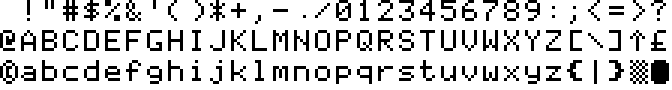
PixelMix
Reference: pixelmix.ttf via DaFont
This is a popular 5×7 dot matrix font by Andrew Tyler, freely available online for personal use, with over 400,000 downloads on DaFont at the time of writing. The design appears to be based on the A02 ROM of the Hitachi HD44780U, with most of the alphanumeric characters matching it. While the small letters are therefore a bit wonky and inconsistent, it does have the very effective slash and backslash seen in FF Dot Matrix above.
| P 😍 | M 😕 | I 🤔 |
|---|---|---|
|
|
|
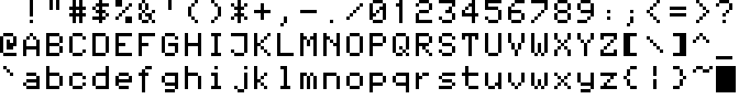
5by7
Reference: 5by7.ttf via peter-wiegel.de
This open-source font by Peter Wiegel was inspired by his first font project: modifying the character set of a laboratory instrument to support German umlauts. Although the glyphs are strictly limited to a 5×7 matrix, it is a proportional font, so narrow glyphs have only one dot of spacing.
| P 😍 | M 😕 | I 🤔 |
|---|---|---|
|
|
|
|
Minecraft
Reference: ascii.png (game texture file)
Although this is by far the most stylised font shown here, I felt it was worth examining since it belongs to the best-selling video game of all time; countless words in this font have been read by hundreds of millions of people around the world. This makes it a significant design with wide recognition, especially amongst young people.
In monospaced fonts like those above (except PixelMix), it was normal to include serifs on 1 I i l for extra width. The Minecraft font is proportionally spaced, however, so many glyphs are much wider or narrower than usual. Additionally, the proportions of many glyphs (like the small punctuation marks, small raised asterisk, full-height slashes, etc.) are unusual for 5×7 dot matrix fonts, but perfectly normal for conventional typefaces. These features all help to give the Minecraft font a more contemporary feel.
| P 😍 | M 😕 | I 🤔 |
|---|---|---|
|
|
Beyond ASCII
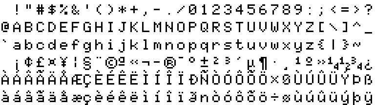
There has long been more to computer fonts than the 95 printable ASCII characters. Some of the fonts examined above contained accented letters and other special characters, which we will now explore further. Where necessary, I have rearranged the glyphs to match the order of ISO‑8859‑1 (and thereby Unicode's Latin‑1 Supplement block) to make comparison easier.
See how the diacritical marks are very large, compared to conventional typefaces, owing to the number of dots required to define them.
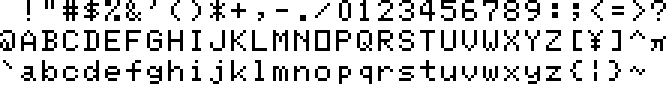
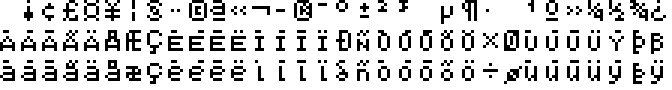
Mullard SAA5050
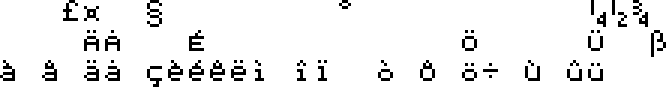
This set is a composite of the various language versions of the SAA5050 that were offered.
| P 😍 | M 😕 | I 🤔 |
|---|---|---|
|
|
|
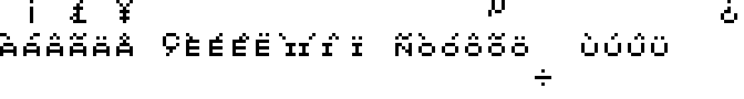
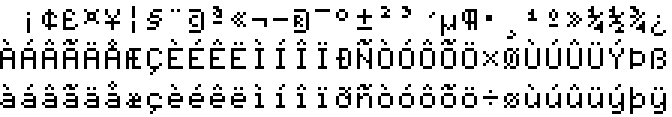
Level III BASIC (Sega SC-3000)
| P 😍 | M 😕 | I 🤔 |
|---|---|---|
|
|
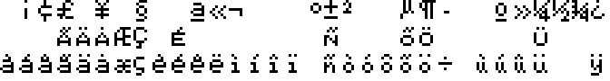
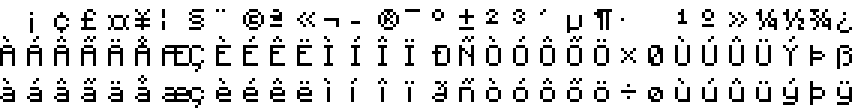
MSX
| P 😍 | M 😕 | I 🤔 |
|---|---|---|
|
|
|
|
Hitachi HD44780U
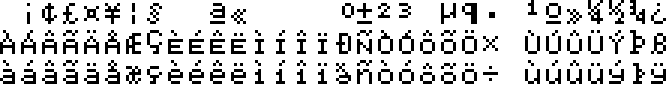
These glyphs are from the A02 ROM version of the HD44780U, which lacks descenders but does contain most of the ISO‑8859‑1 character set.
| P 😍 | M 😕 | I 🤔 |
|---|---|---|
|
|
|
Command Prompt (Microsoft Windows)
These glyphs come from the system file app850.fon, (presumably named for Code Page 850) as it contains all the characters of ISO‑8859‑1.
| P 😍 | M 😕 | I 🤔 |
|---|---|---|
|
|
|
Fairfax
This font employs full-height accented capitals, with separate (not conjoined) diacritical marks. This greatly enhances its consistency, legibility and modernity, not to mention its suitability for writing languages other than English.
| P 😍 | M 😕 | I 🤔 |
|---|---|---|
|
|
|
Minecraft
This font makes use of wider glyphs as well as taller ones, giving it the largest character cells shown on this page.
| P 😍 | M 😕 | I 🤔 |
|---|---|---|
|
|
|
My past designs
I created my first dot-matrix font in 2013, using pencil and graph paper. I then scanned and digitised it with the help of Microsoft Paint. Ever since then, tinkering with such designs has been an occasional pastime for me. Initially, I did this with relatively little outside inspiration, but over time my work lost some originality in favour of more conventional (and usually better) design choices. Most were not based on 5×7 dot matrices, but below are four selected designs that were.
There is little to say about these designs that hasn’t already been mentioned above, but I will note some of the more interesting features:
Untitled, 2014
This was one of my earliest efforts, based on the 7×7 font I created first. The long ascenders and descenders, number 1, capital letters A I S V Y and small j are all unusual designs. The small letters almost have the traditionally correct shapes, if not for d.
Untitled, 2014
This is an improved version of the previous design, now based on smaller character cells. Here, I had arrived upon my favourite design of the slashes / \, which admittedly doesn’t work very well in the per cent sign %. There is also a unique design for the capital G and the rare variant of R, which I must have created independently. I remember adding the extra curves to S after seeing other examples and realising my previous effort was rather unusual.
Untitled, 2018
This design was created from scratch, without reference to any previous efforts. All the alphanumeric characters here are strictly 5 dots wide, including 1 I i j l. We can see the introduction of my favourite design for the question mark ?, and the capital Y no longer resembles V.
QS Matrix 1.0, 2019
This design was created primarily as a font for the Quikscript and Shavian alphabets, hence the name QS Matrix. The design may have been based on the previous one, as it shares many similarities. The small y is unusual, and was inspired by the one from the Commodore MPS-803 printer as seen above.
Version 2 of this font was made after beginning the study documented here. As a result, I decided to alter some glyphs to make the font appear a little more generic.
Honourable mentions
I only discovered the following examples after this study was complete and all key glyphs for Matrix Sans were already designed. Nevertheless, in the interests of completeness, here are all of the remaining 5×7 dot matrix fonts that I have found (excluding most modern designs that can be found on websites such as FontStruct, as they are high in quantity and low in quality). Most of them still have many unique and unusual features:
Texas Instruments TMS9918 data book
Reference: TMS9918 Data Book
From the data book pertaining to the video chip used in countless computers and video game systems of the 1980s. The small capital-style lower case is similar to that seen in the font from the TI 99/4A computer (see above).
Sinclair QL
Reference: Sinclair QL "PM" ROM (see graphic)
Mid-1980s business-oriented microcomputer.
Memotech MTX512
Reference: MEMU emulator (see screenshot)
Mid-1980s home computer. The lower-case alphabet contains a number of oddities.
Monaco
Reference: Infinite Mac emulator
Designed by Susan Kare, this is the 9-point version of the monospaced bitmap font provided with early Apple Macintosh computers. It contains a number of very unusual features (particularly # % 6 9 Q R X) and was probably a fully original design, rather than being largely derivative like almost every other font shown on this page.
SAM Coupé
Reference: SimCoupe emulator (see screenshot)
Late-1980s home computer. The font is very similar to that of the Sinclair QL (see above), with most of the differences being in the lower case letters.
Neckerspoel
Reference: necker.mf from “capbas” font collectiion
A Metafont font dating from the early 1990s. According to the author, the name Neckerspoel “comes from the futuristic bus station in Eindhoven, where they use it in the ‘flip-dot’ displays above the buses.” The characters $ 3 ? ? @ W a i l w are unique or unusual.
Dottie
Reference: Dottie font from MyFonts
An early-2000s commercial typeface.
Results
I attempted strike a balance between four principles when designing my own 5×7 font:
- authenticity
- quirkiness
- consistency
- sound design
The former two qualities are often in conflict with the latter two; for example, the crossbar of small f should ideally be at the waistline, but almost never is in the fonts seen above. Here, I would make the crossbar lower in the interests of authenticity. Doing so also adds a degree of quirkiness, which I think is desirable in such a font.
Of course, there is really a fifth, hidden criterion for choosing these designs: personal taste. Despite attempts to remain impartial, some of my preferences — even dating back to my earliest, inexperienced designs — have sneaked into this project. Most notable are the rare less-than and greater-than signs < > and question mark ?, and the (possibly) unique small m. To be fair, these instances can actually be justified under the sound design principle, as sometimes the most common variant seen above just isn’t very good (in my opinion). But perhaps it is only right that I do leave some kind of mark here, rather than creating the most generic design possible.
So, after seeing a dizzying array of 5×7 dot matrix fonts from past and present, it is finally time to design my new font. I consider the following glyphs to be easy choices, because the overwhelming majority of existing fonts use them or because they have no reasonable alternatives:
While this image only spans the range of the ISO‑8859‑1 character set, I plan for the font to support both Adobe Latin 4 and Google Fonts Latin Expert Google Fonts Latin Level 4 Google Fonts Latin Core-Vietnamese-Plus, which have much wider Unicode coverage. Also note that I have had to extend the character cells to 7 dots wide in order to fit the vulgar fractions ¼ ½ ¾, and the copyright and registered trademark symbols © ®, which require 6 dots of width. It is possible to make those fractions only 5 dots wide, as in the Mullard SAA5050 seen above, but that scheme would not work for the others like ⅔ ⅜ ⅝ ⅞.
To fill in the gaps of the above figure, I judged which option would best suit my intended aesthetic for the font, based on the four principles mentioned at the start of this section and visual trials of different variations. I consider many of these options to be equally good. In fact, in some cases my real personal preference ended up as the second choice, since I ultimately decided a different option was more suitable for the font as a whole. The following table lists the glyphs I chose from, in decreasing order of preference (i.e. with my final decision leftmost):
| Options | Rationale |
|---|---|
 |
Option 2 is too big, so much so that it might confuse contemporary audiences. |
 |
Tests proved the bold punctuation marks don’t suit the font as a whole. This choice also applies to others like the comma, colon, etc. |
 |
The 3-dot hyphen suits texts better and the 5-dot variant makes a better minus sign. Since this Unicode character does double duty, the 4-dot variant is a compromise. |
 |
I am fond of Option 2, but it is so rare that the authenticity principle dictated Option 1 in this case. |
 |
A more understated design and far more common. |
 |
Chosen as it appears less sharp and angular, better fitting with the other digits. |
 |
Option 2 is more legible and better distinguished from 8 and the Cyrillic letter З, but probably too rare to use here. |
 |
The smaller less-than and greater-than signs are a better fit with both the other mathematical operators and conventional typefaces. |
 |
Option 3 lacks the point of inflection that I think question marks should have and Option 2 has a cramped upper curve, failing the sound design principle. |
 |
I like Option 2, but Option 1 is the more common design and looks better in the context of email addresses, etc. |
 |
Option 2 here (as with D G below) is more consistent with the other capitals and arguably a more sound design. I chose Option 1 to inject a little more quirkiness to the font. |
 |
Reasons as noted for A above. Option 1 is also much more legible. |
 |
Reasons as noted for A above. Options 3 and 4 are perhaps a little too exaggerated for this font. |
 |
Chosen for consistency with capital I. |
 |
Both have imperfect diagonals. I’ve changed my mind on this one over the years, but at the moment Option 2 looks stranger to me. |
 |
Less legible than Option 2, but chosen for consistency with A and v. |
 |
Also less legible than Option 2, but chosen for consistency with V v w |
 |
The more common design, which I also feel looks slightly nicer. |
 |
A tough decision. Option 3 matches option 2 of h n r u, which I don’t like very much. Option 2 is the most well-designed; perhaps too well-designed for this font. Therefore, I chose Option 1 for being suitably quirky, yet functional. |
 |
Although Options 2 and 3 are more legible, I prefer glyphs that are 5 dots wide and Option 2 is unattractive. |
 |
The shorter terminal makes the letter look clearer to me. |
 |
Is 5 dots wide, more open and legible, more authentic, and the hook is consistent with j t. |
 |
I much prefer the look of option 1. It is also consistent with b d etc. |
 |
The hook is consistent with f t and the serif is consistent with i. |
 |
Is 5 dots wide and more open and legible. |
 |
This feels most natural to me and is a compromise between the other, equally common, options. |
 |
Option 2 would match Option 2 of b h etc. |
 |
Similar reasons as for f. |
 |
Option 2 looks like the two sides are curved, rather than diagonal. Option 1 has straight sides but clear diagonals near the bottom. |
 |
Chosen for consistency with m. |
 |
Another tough decision. I like option 2 and its effect on the typographic colour of text in the font, but it is rather rare and other people don’t seem to like it as much. |
 |
Option 1 is highly exaggerated, but I find the others too hard to recognise as curly brackets. |
 |
A more understated design that is more consistent with the rest of the font. |
 |
Same reasons as for the pound sign £ above. |
 |
Chosen for consistency with the pilcrow/paragraph sign ¶. |
 |
Option 3 has no separation between the pair and Option 2 is too stylistic. |
 |
A more traditional Greek shape, and unrelated to the design of u as it technically should be. |
 |
The longer version has better visual proportions. |
 |
I feel that Option 1 best suits the overall character of the font. |
With those more difficult choices made, here is the final design I arrived upon. In my view, it contains all of the best features from the many designs examined above and none of the worst:
This may be the most effort anyone has ever put into a classic dot matrix-style font. I hope you find the result useful!